
Improving Training Provider Engagement


The improved design increased provider engagement by 32% and reduced administrative overhead by an estimated 10–15 hours per month, and demonstrated how thoughtful UX can drive measurable outcomes for both users and the business.
The Process
The project started with a familiar problem: processes spread too thin. Applications were tracked in spreadsheets, approvals lived in email chains, and third-party systems only covered the very first step. Admins spent too much time chasing statuses, providers lacked visibility, and there was not reliable history trail.

During research, Interviewed training providers and analysed current workflows to understand barriers to engagement. Key pain points included multiple logins, lost links, and difficulty tracking progress.

Collaboration, Worked closely with the product owner and lead developer to balance technical constraints with business goals. Facilitated workshops to prioritise improvements and define what could be delivered within scope.

Design & Delivery Prototyped and tested concepts in Figma, refining flows around a central hub, simplified notifications, and improved progress tracking. Partnered with engineering to guide delivery, managed rollout activities, and created self-service onboarding documents to support confident adoption without heavy reliance on support teams.
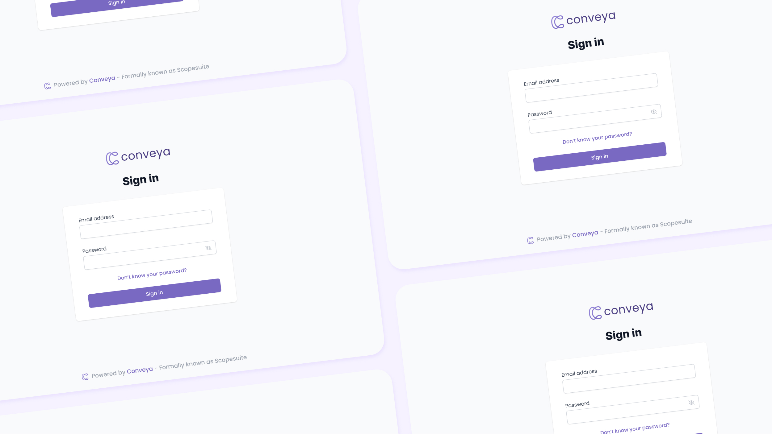
The solution delivered a unified platform for training providers, giving them a single hub to access reports, track progress, and submit updates, simplifying workflows, reducing admin effort, and driving higher engagement across the board.


The redesign simplified reporting and removed major barriers to engagement. Providers accessed all reports from a single hub, saving time and reducing confusion. This shift led to a 133% increase in total reports submitted, a 32% higher submission rate per provider, and cut 10–15 hours of admin work per month. Notifications were clearer, duplicate work was eliminated, and progress visibility improved for both providers and internal teams.
💬 One provider summed it up best: “It’s a chore locating all the emails.”
Key Takeaways & Reflection
Designing with empathy was key, providers had little incentive to engage, so reducing friction created the biggest impact. Close collaboration with product and development leads ensured business goals and technical constraints stayed aligned. The project demonstrated how thoughtful UX can deliver measurable results, improving engagement, reducing overhead, and creating a process that felt effortless instead of tedious.

